# SushiTextInputField
Text input fields allow users to enter and edit text. It is not directly an EditText, but an
extension of TextInputLayout from Material Components. It contains an TextInputEditText inside, which is exposed as editText
# Features
All XML attributes of Material TextInputLayout, like errorEnabled are supported. Also most
attributes of EditText like hint, inputType are proxied into the internal EditText
| Attribute | Value |
|---|---|
| style | @style/Widget.Sushi.TextInputField or @style/Widget.Sushi.TextInputField.Outlined |
| app:drawableLeft | @drawable or @string which is treated as iconfont character |
| app:drawableRight | @drawable or @string which is treated as iconfont character |
| app:drawableStart | @drawable or @string which is treated as iconfont character |
| app:drawableEnd | @drawable or @string which is treated as iconfont character |
| android:hint | The hint inside the internal EditText |
| android:inputType | The input type, for eg. text textPassword, date, number |
NOTE
For all the four drawable properties, use app:drawableLeft
and never android:drawableLeft.
Behaviour with drawableTop and drawableBottom
is also unspecified. This view only handles horizontal drawables properly.
# Usage
# Creating in XML
You can set drawableRight or drawableLeft, either as @drawable or a @string which is
font icon character
<com.zomato.sushilib.molecules.inputfields.SushiTextInputField
android:id="@+id/textFieldRecipient"
style="@style/Widget.Sushi.TextInputField"
android:layout_width="match_parent"
android:layout_height="wrap_content"
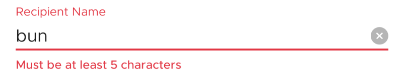
android:hint="Recipient Name"
app:drawableEnd="@string/icon_cross_filled"
app:errorEnabled="true" />
# Functionality via Java/Kotlin
Via setEdgeDrawableClickListener you can decide what happens
when the drawableStart (left) or drawableEnd (right) is clicked
textFieldRecipient.setEdgeDrawableClickListener(
    object : SushiTextInputField.EdgeDrawableClickListener {
        override fun onDrawableStartClicked() {}

        override fun onDrawableEndClicked() {
            rootView.textFieldRecipient.editText?.setText("")
        }

    })
You can also use setTextValidator to add a validation function that takes
the current text and returns an error (or null, if no error). The validator is called
every time text changes.
textFieldRecipient.setTextValidator { text ->
    "Must be at least 5 characters".takeIf {
        TextUtils.isEmpty(text) || TextUtils.getTrimmedLength(text) < 5
    }
}
# Examples
# Drawable (Clear Button)

# Error Handling
# Outlined (for Searchbox)
