# SushiButton

A view that allows users to tap to trigger an action. SushiButton is fully based on
MaterialButton
# Features
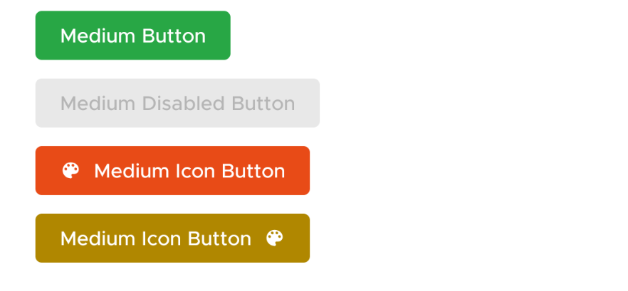
SushiButton comes with following properties
| Attribute | Value |
|---|---|
| app:buttonDimensions | large, medium or small |
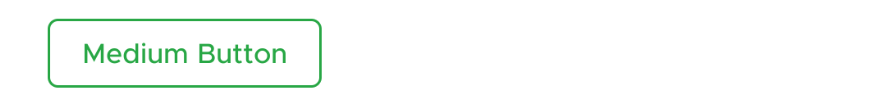
| app:buttonType | solid, outline or text |
| app:buttonColor | And @color/ attribute that we use to theme the button |
| app:drawableLeft | @drawable or @string which is treated as iconfont character |
| app:drawableRight | @drawable or @string which is treated as iconfont character |
| app:drawableStart | @drawable or @string which is treated as iconfont character |
| app:drawableEnd | @drawable or @string which is treated as iconfont character |
NOTE
For all the four drawable properties, use app:drawableLeft
and never android:drawableLeft.
Behaviour with drawableTop and drawableBottom
is also unspecified. This view only handles horizontal drawables properly.
# Unsupported Properties
Do not set textSize, textColor and background manually. Rely only on above
properties to set a proper button theme for you.
Setting unsupported properties may throw UnsupportedException in future
# Usage
# Creating in XML
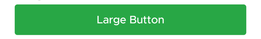
  <com.zomato.sushilib.atoms.buttons.SushiButton
      app:buttonType="solid"
      app:buttonDimensions="large"
      android:layout_width="match_parent"
      android:layout_height="wrap_content"
      android:text="Large Button" />
# Changing Properties Programatically
sushiButton.setButtonType(ButtonType.SOLID)
sushiButton.setButtonDimension(ButtonDimension.LARGE)
# Examples
# Types
You can set button type using either XML in layouts, or programatically in Java/Kotlin
# Solid
# Outline
# Text

# Dimensions
INFO
Some libraries (including Google's GMS) use buttonSize as an attribute
that accepts @dimen type values. So as to not conflict with that attribute,
we use the attribute buttonDimension. Do not set size, padding and font size
on your own, and use one of the preset buttonDimension values only.
# Large
# Medium
# Small

# Colors
We support using any color (we set the text color, the disabled state tint lists accordingly).