# Sushi UI Kit
Sushi is a delicious UI Kit built by Zomato that should help you build bespoke user interfaces following an atomic, clean and simple design language.
While Sushi builds up on it's own design language, it fully embraces and extends upon Android's native UI guidelines, and uses Google's Material Design components internally in many places.
# Cross Platform, yet Native

The Sushi project aims to build a uniform and cohesive design language that works across iOS, Android and Web. But we respect and embrace the native UI guidelines of each platform. Sushi on Android produces beautiful ripples when clicked, keeps toolbar alignment just like what Android evangelizes.
Apps and websites built with Sushi will look similar, yet not jarring for the respective native platforms.
# Atomic Design
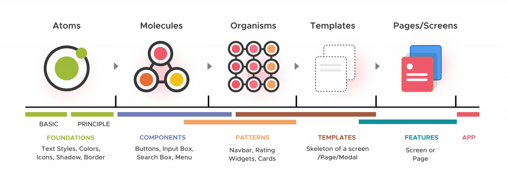
Sushi, following atomic design principles, is built bottom-up using composable components, ordered as atoms ➡️ molecules ➡️ organisms.

# Atoms
The smallest indivisible units are atoms. In Android (or any mobile UI) text labels, buttons, image holders are atoms.
# Molecules
Views that involve multiple atoms to form, but still look and behave like a single entity to the user are molecules. For example, input fields have the input box, the error field, and a clear button, but together it is a single entity.
# Organisms
Complex, but reusable components, that work a cohesive way together. Composed of multiple atoms and molecules. A case in point being rating bars, which consists of tags, each having a number and an icon. The tags change color as well, when different ratings are selected. Each tag individually is also used at other places, but as a rating bar, it all works together to create new meaning.